1 · About the project
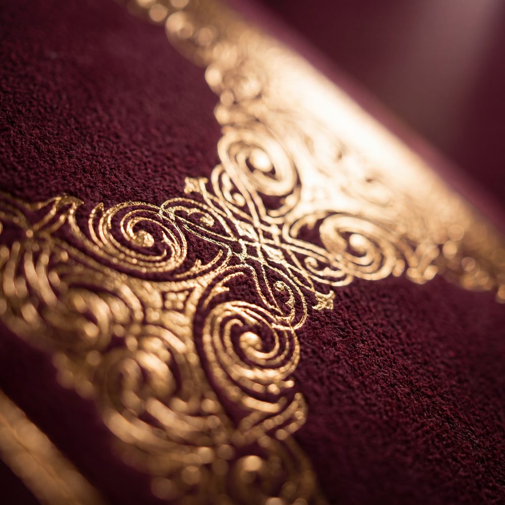
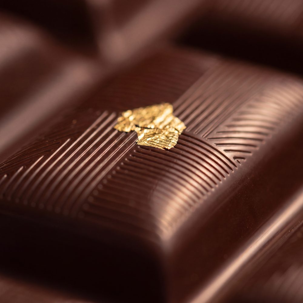
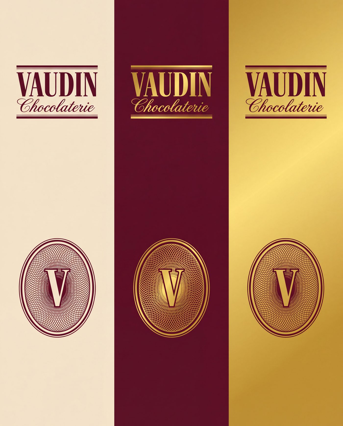
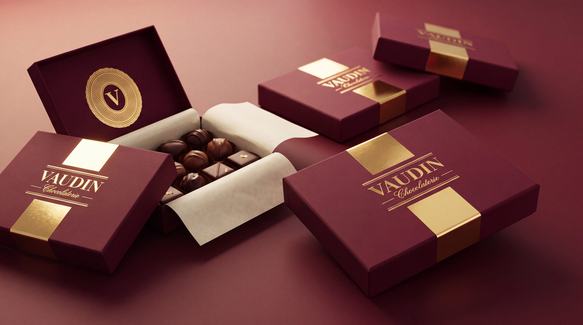
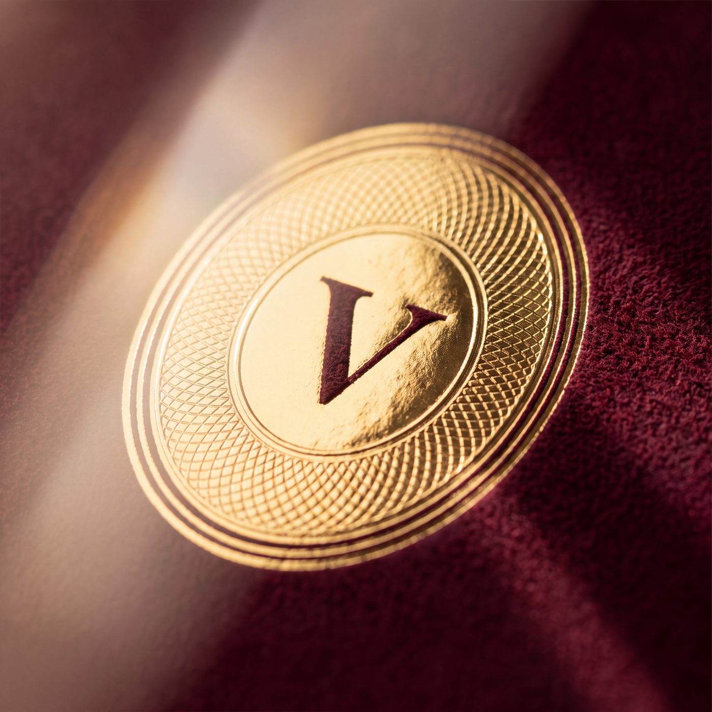
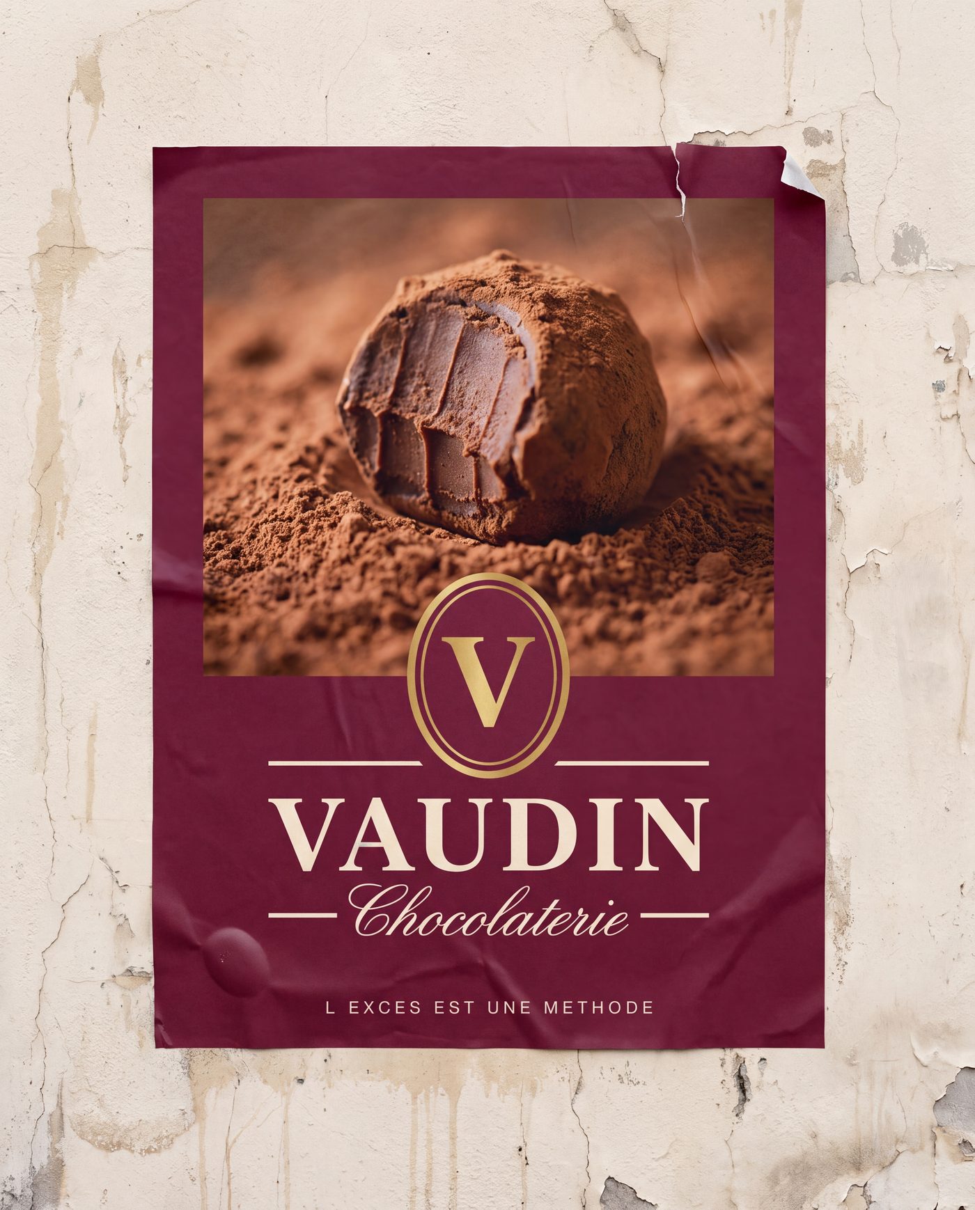
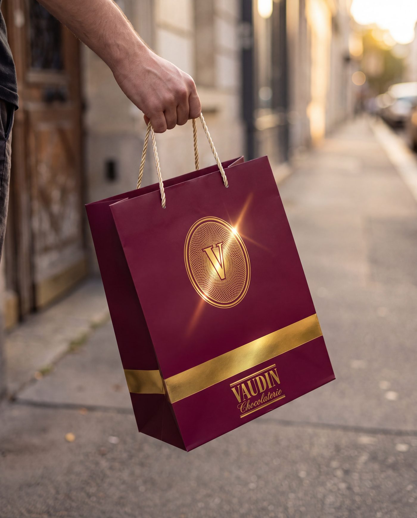
Chocolaterie Vaudin has worked the bean since 1911, four generations, a laboratory above the shop. Drum roasting, long conching, plate moulding, and a packaging tradition inherited from the printing trade: engraved cartouches, guilloche patterns, hot foil gilding, hand marbled paper folded around every bar.
The problem arrived in 2019, and the house did it to itself. To look contemporary, it stripped everything back: raw kraft, thin sans serif, one flat colour, a great deal of empty space. Within six months a hundred and ten year old house had become indistinguishable from twenty bean to bar labels founded the year before. The heritage had not been modernised, it had been erased, and the price followed the resemblance.
2 · The process
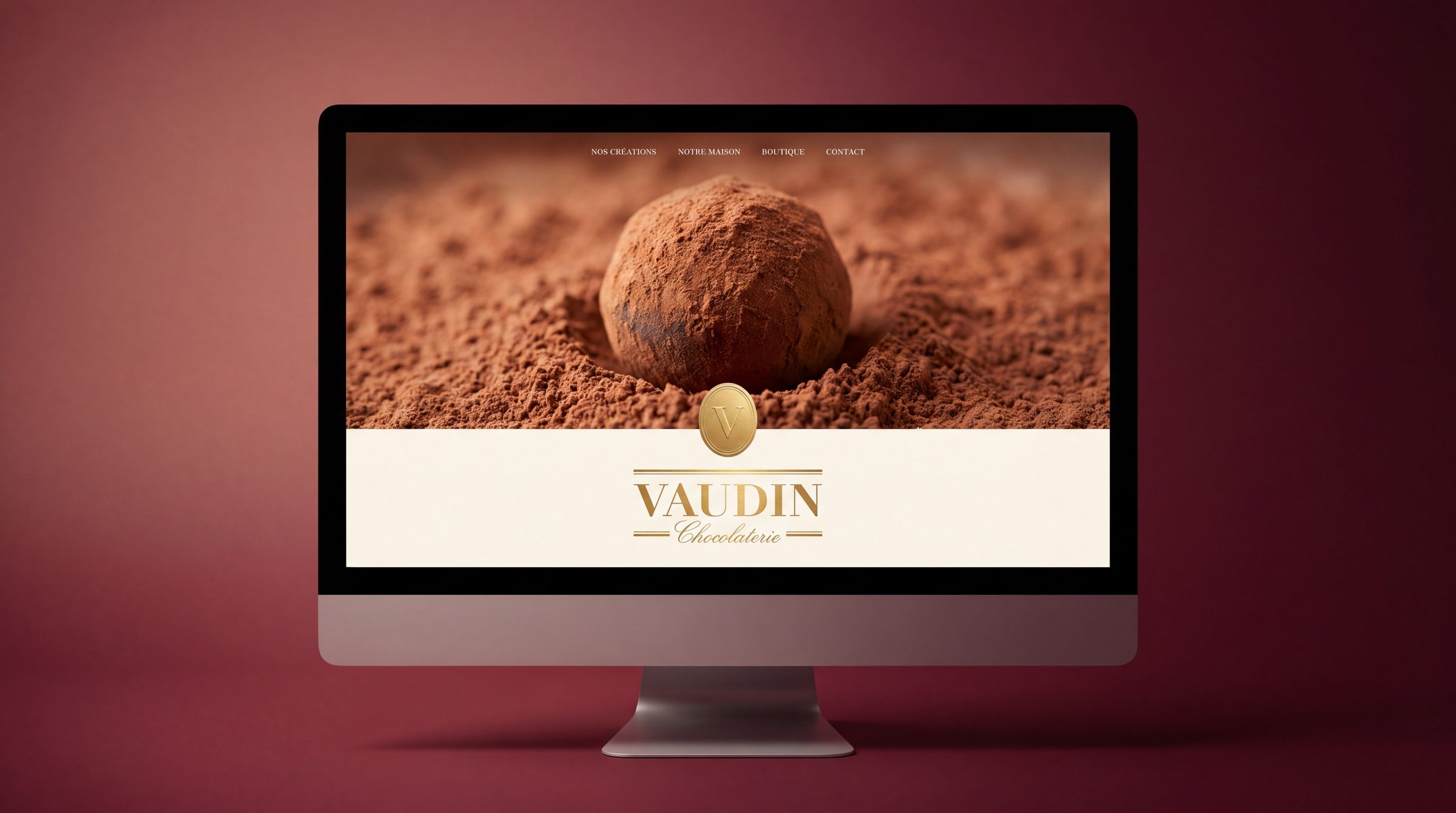
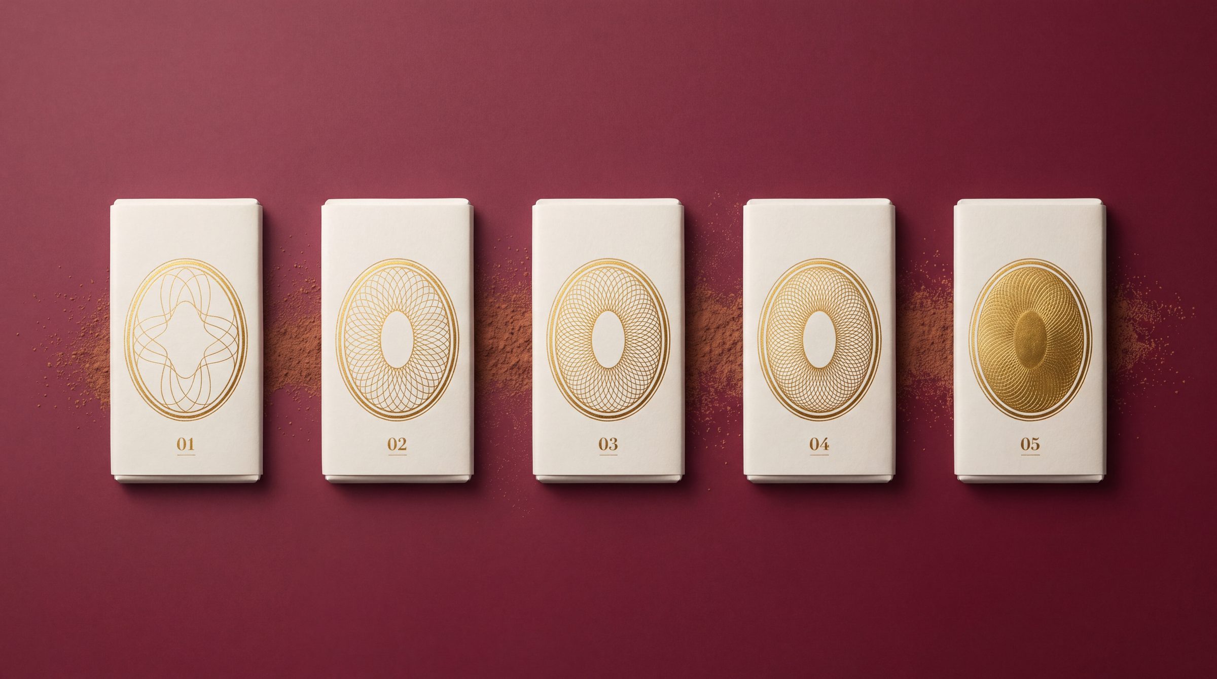
The repositioning came down to one reversal: stop removing in order to look serious, add in order to prove the work. Every ornament in the system corresponds to a real manual operation, and nothing is decorative in the idle sense.
3 · The moodboard
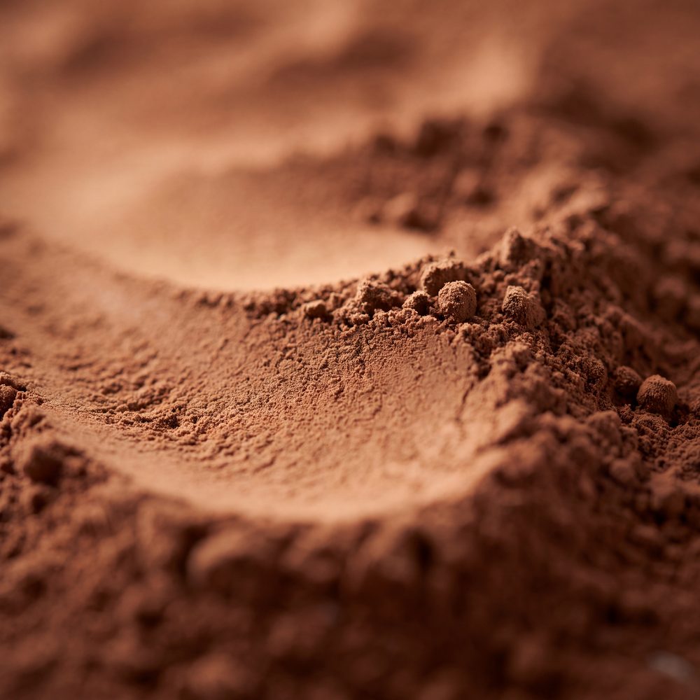
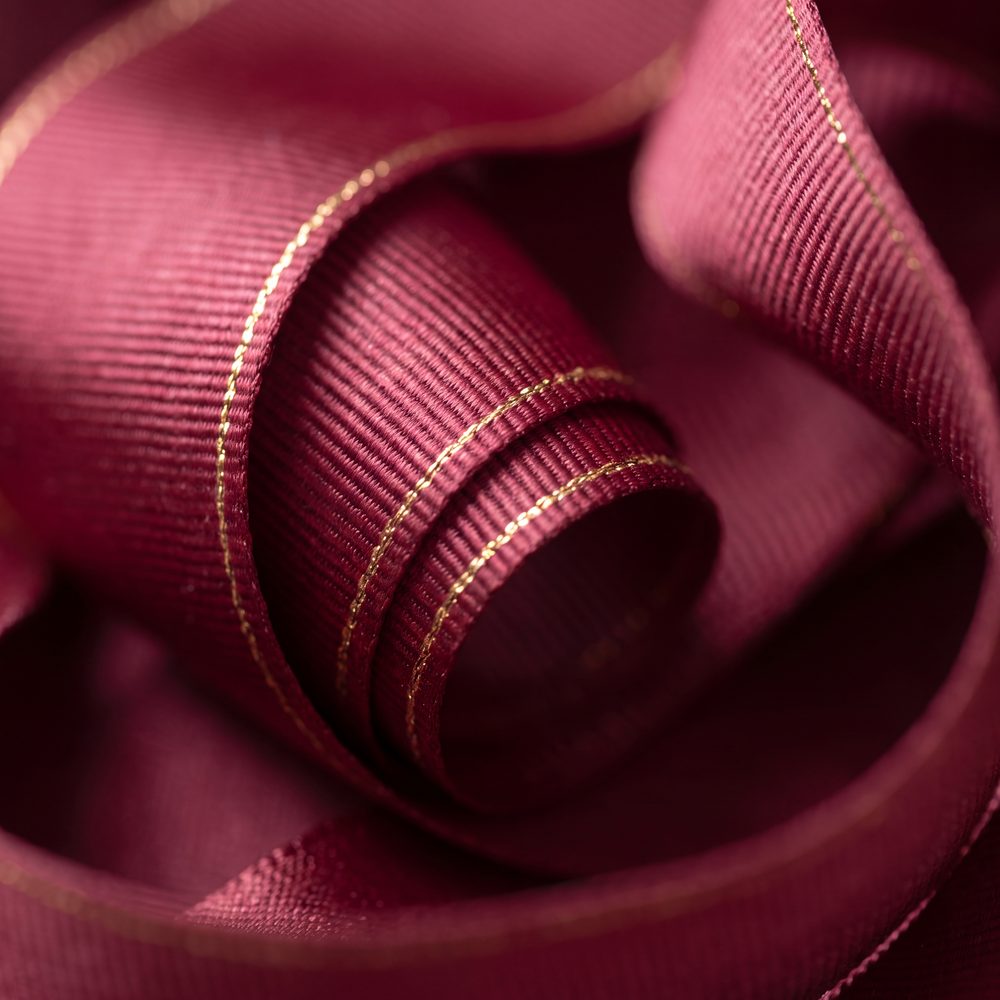
ornate · gilded · dense
Abril Fatface · didone grasse
Chocolaterie Vaudin
Pinyon Script · anglaise cursive
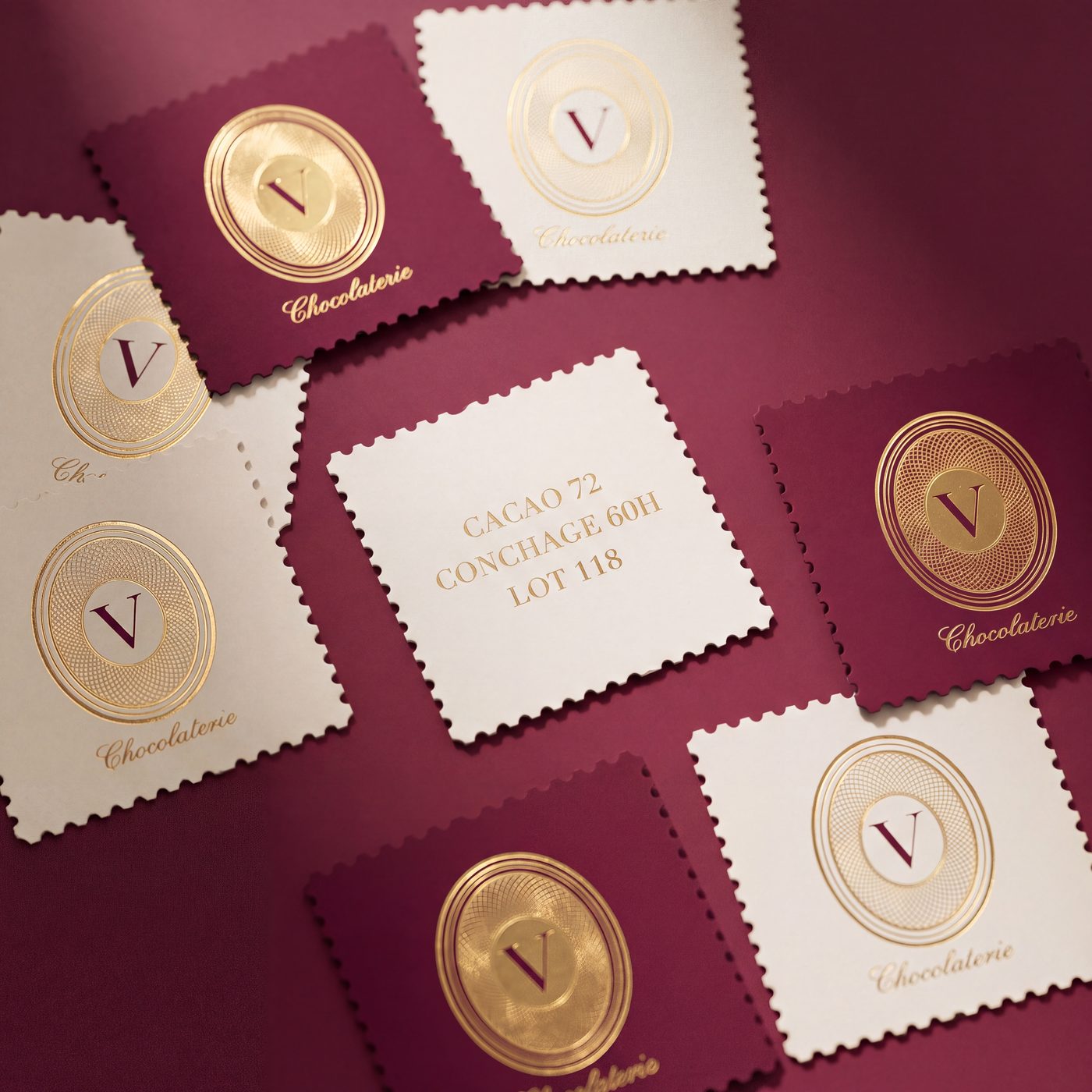
CACAO 72 · CONCHING 60 H · Every ornament is one more operation.
4 · The site in motion
0:00

Design note
Kilvern · Art direction
“I was asked to strip it back. That was precisely the mistake the whole category had made ten years earlier: emptiness had become so common that it no longer signalled anything at all. I put back every rule, every guilloche, every gilded line, under one condition: an ornament must always correspond to an operation actually carried out by hand. The density is not nostalgia, it is a record of labour. The competitor was never another chocolate maker, it was a received idea about what luxury is supposed to look like.”
A similar project?