Scroll to explore ↓ (04)

Domaine Lascaze

Industry

Wine & spirits

Scope

  • Positioning and brand platform
  • Logotype, double rule and DL monogram
  • Brand motif and material variants
  • Palette and photographic protocol
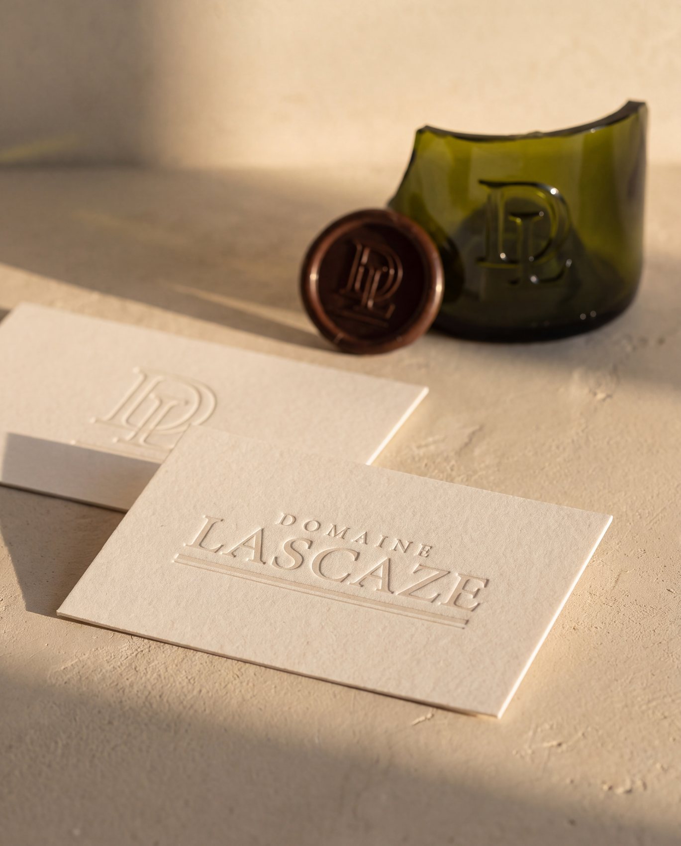
  • Labels, moulded glass, menu card and stationery
  • Brand guidelines and source files

1 · About the project

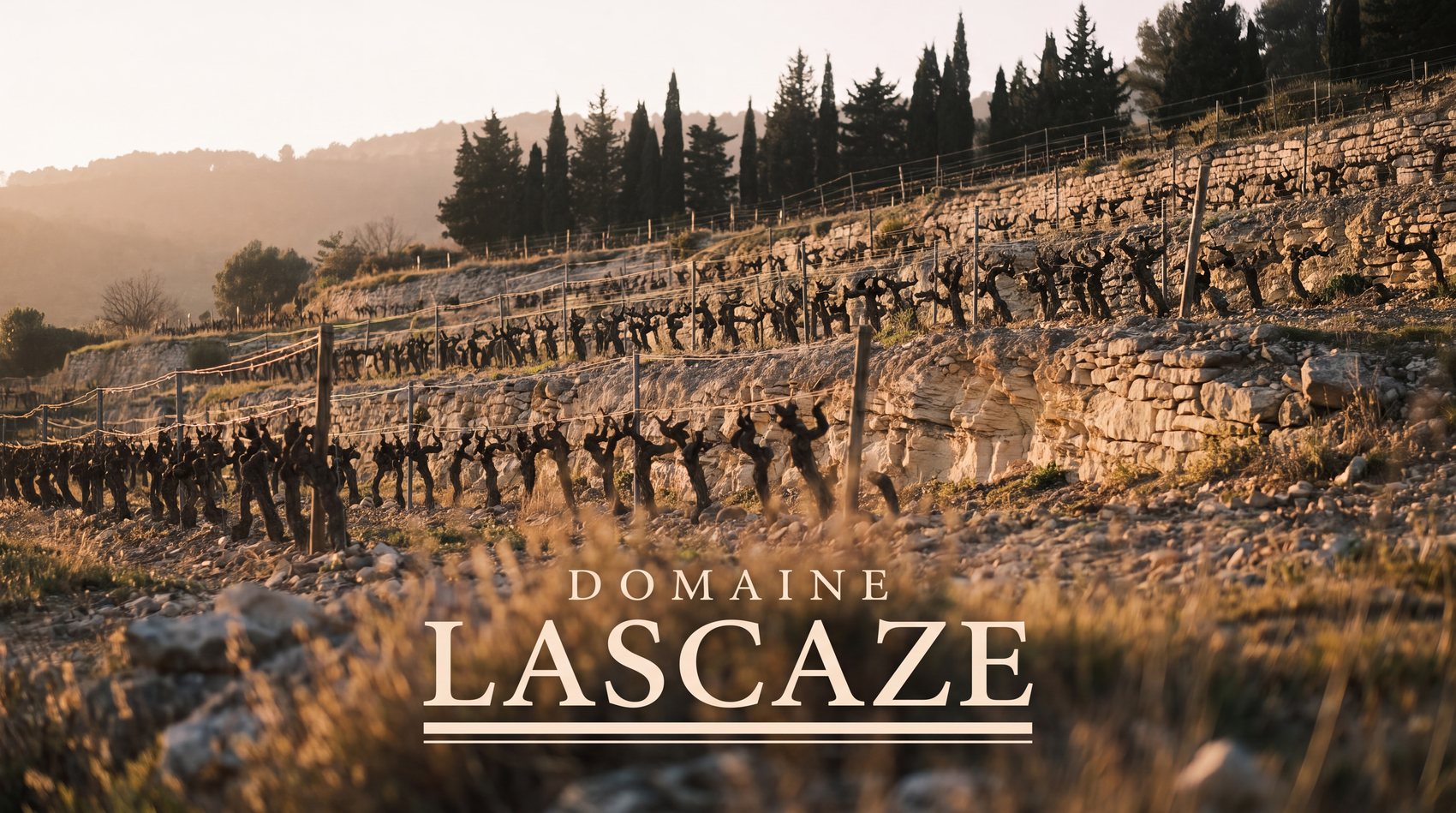
Domaine Lascaze, forty hectares on hard limestone slopes in Provence, four generations. The rock surfaces in the vines, in the dry stone walls and in the walls of the house, which is built from the same stone the roots go down into. The estate makes red, white and sparkling. It stopped making rosé in 2016.

Quality was never the problem, it was there. The region was. Provence rosé presents itself the same way everywhere, pale glass, pink liquid, pastel gradient, a stretch of coast, and that image has ended up covering everything that comes from here, including what is not pink. Lascaze dressed its reds like its rosé, only quieter, and sold two serious wines at the price of a summer one.

2 · The process

The repositioning came down to one shift: stop showing the wine, show the rock that makes it. It is white, hard and visible, and it is the exact opposite of pastel.

  • Territory audit: the iconography of rosé identified as the primary competitor, ahead of other estates
  • Brand platform: the cause before the product, the stone before the colour of the wine
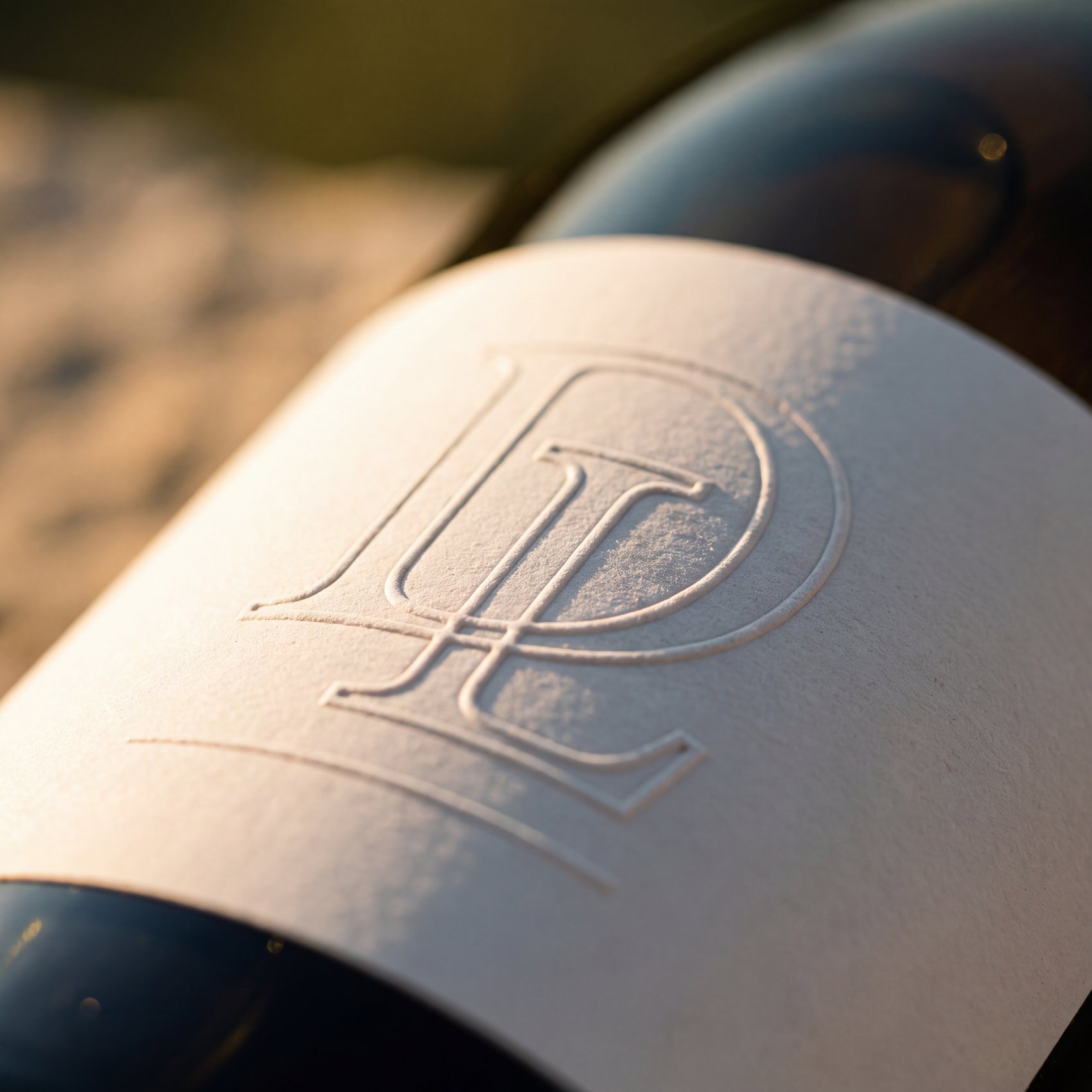
  • A typographic system: wordmark, double rule of unequal weights, interlaced DL monogram
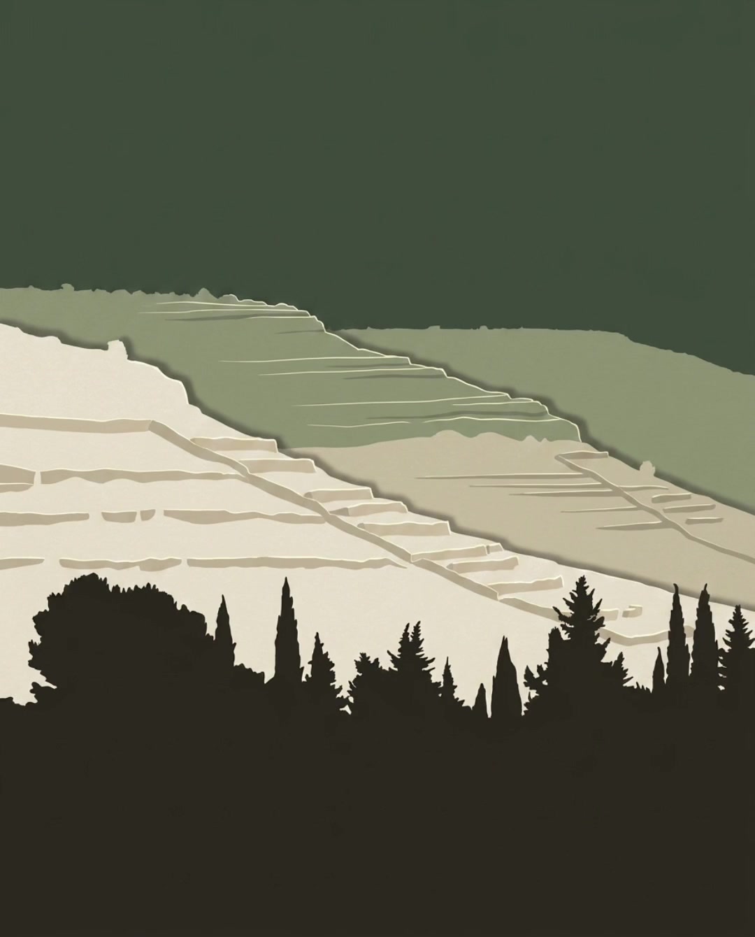
  • A brand motif: the profile of the terraced slope, surveyed on site, declined by material and never by shape
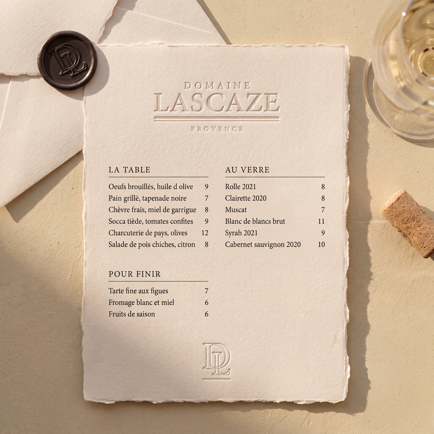
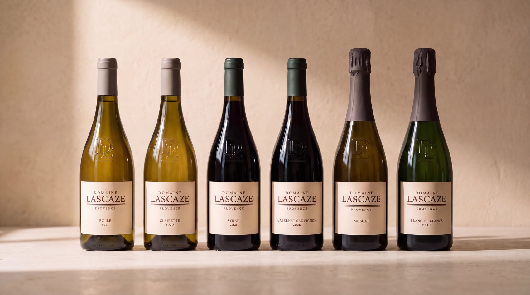
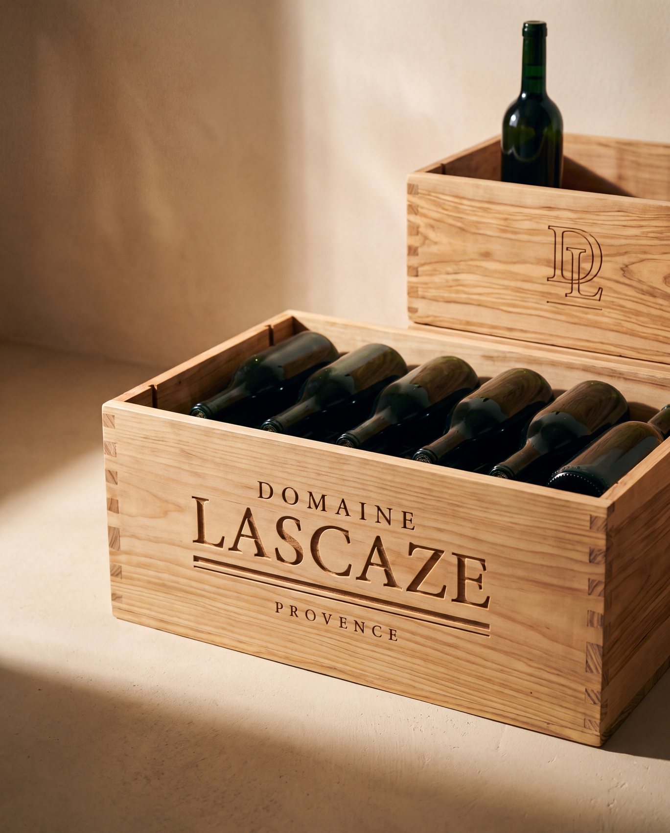
  • Blind embossing, glass moulded at the shoulder, wax seals, carved wood, no gilding, no gradient, no pink

3 · The moodboard

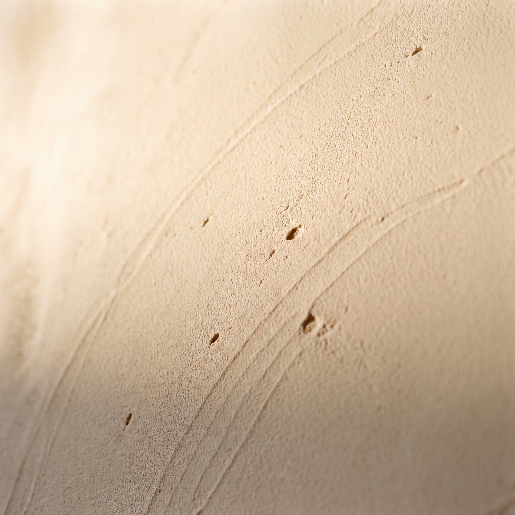
limestone · banded · dry
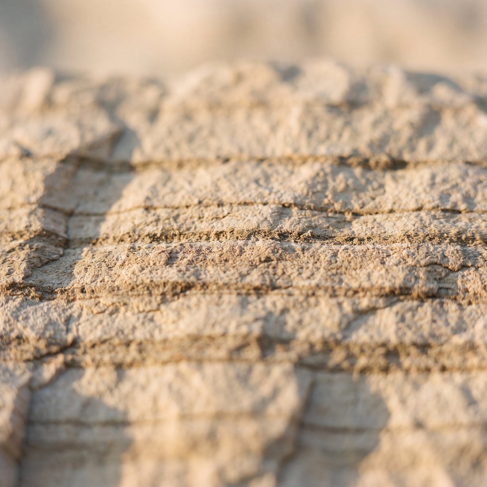
Domaine Lascaze brand identity, wine and spirits, moodboard 1
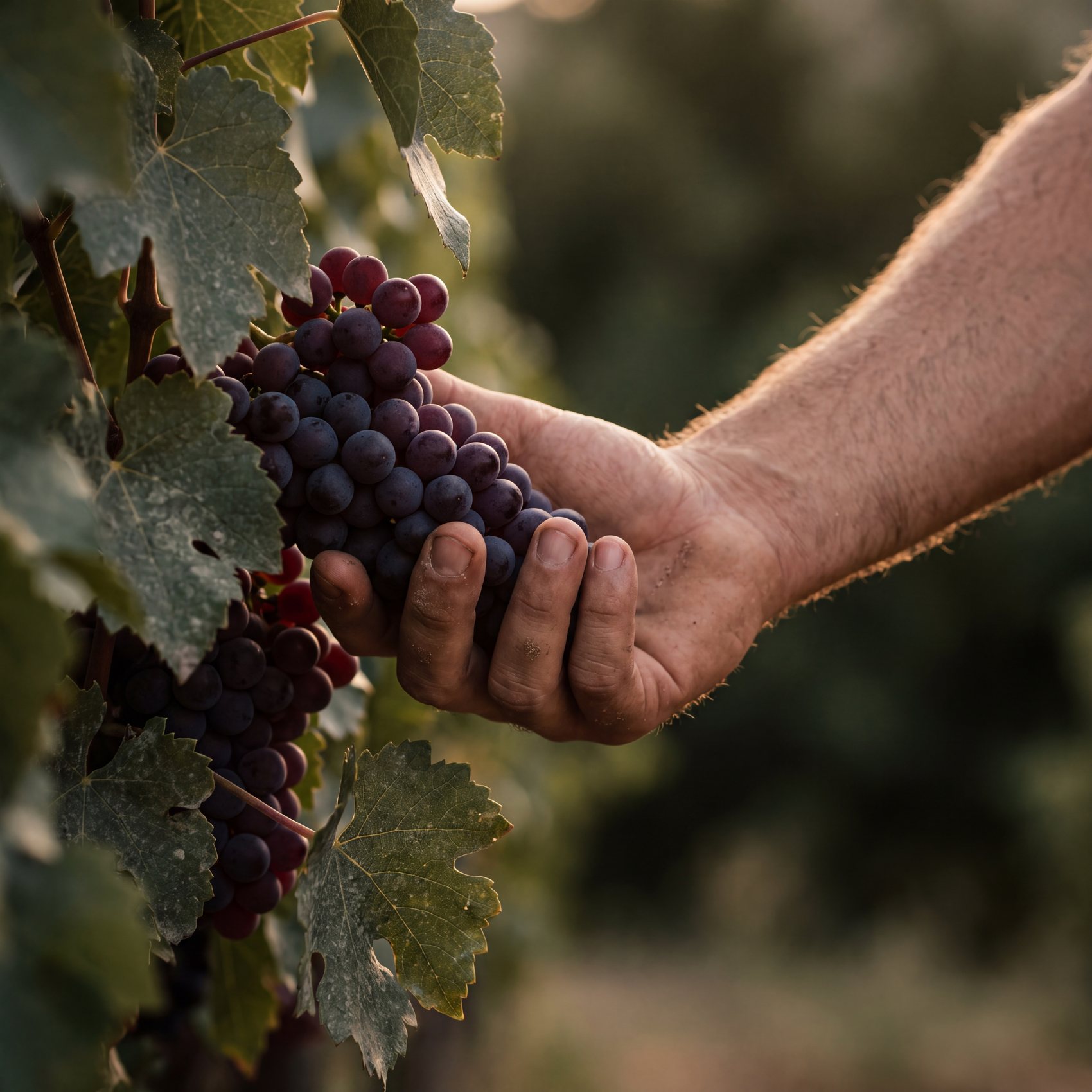
Domaine Lascaze brand identity, wine and spirits, moodboard 2
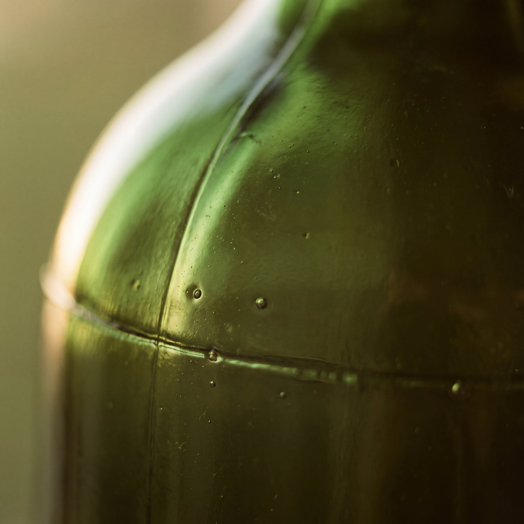
Domaine Lascaze brand identity, wine and spirits, moodboard 3
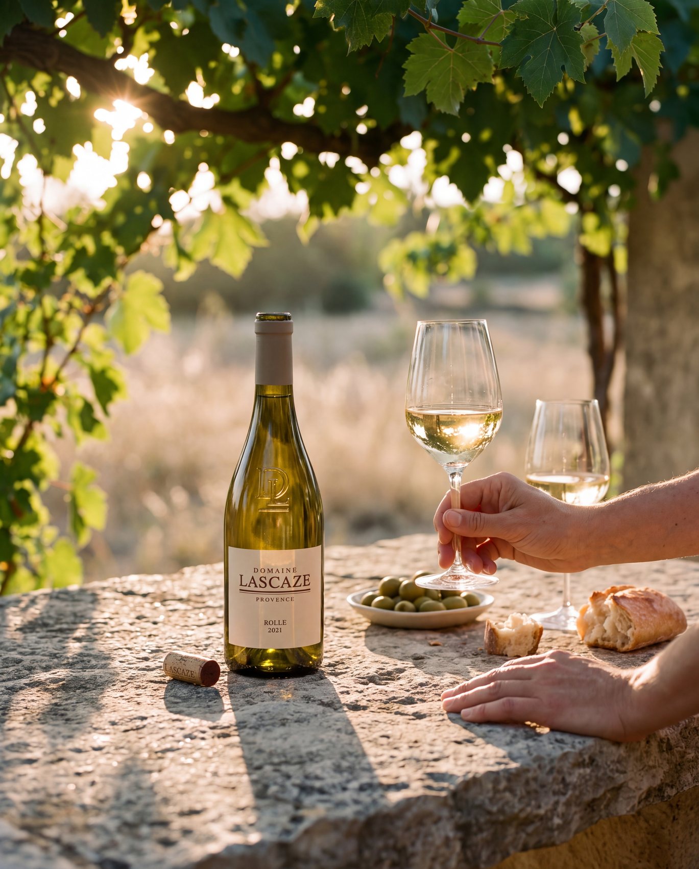
Domaine Lascaze brand identity, wine and spirits, moodboard 4

Cormorant Garamond · capitales à fort contraste

Domaine Lascaze

Karla · humaniste, petit corps

UPPER SLOPE 240 M · BLIND EMBOSSED · The rock first, the wine after.

#E7E1CE · Calcaire blond
#C9C0A6 · Poussière de garrigue
#8E9779 · Feuille d’olivier
#3E4A3C · Vert de cyprès
#2A2620 · Ombre de calcaire
Domaine Lascaze brand identity, wine and spirits, image 1
Domaine Lascaze brand identity, wine and spirits, image 2
Domaine Lascaze brand identity, wine and spirits, image 3
Domaine Lascaze brand identity, wine and spirits, image 4
Domaine Lascaze brand identity, wine and spirits, image 5
Domaine Lascaze brand identity, wine and spirits, image 6
Domaine Lascaze brand identity, wine and spirits, image 7
Domaine Lascaze brand identity, wine and spirits, image 8
Domaine Lascaze brand identity, wine and spirits, image 9

Design note

Kilvern · Art direction

“The brief asked me to stand apart from other estates. The real competitor was none of them: it was an image, the image of rosé, which covers the whole of Provence and decides on the buyer’s behalf what a wine from here can be. You do not stand apart from an image by doing it better. You change the subject. I stopped showing the wine and started showing the rock, because the rock is what makes the difference in the glass, and because it is hard, white and dry, which is everything pastel is not.”

A similar project?
Let's talk